Communication and Meaning Study / Assignment
Consists of in-class study + expanded homework graded assignment
Quick links on this page:
- Initial Study Objectives
- Final Refinement Objectives
- In-Class Study Instructions
- Homework Refinement Assignment Instructions (graded)
Objectives
Initial Study Objective
Use the Elements and Principles of Design to convey concept within strict formal constraints.
Final Refinement Objective
Develop the concept into a single, refined finished piece, effectively adding typography, color, and graphics enhance conceptual communication.
In-Class Study Instructions
Using only 4 FLAT BLACK SQUARES within a square canvas you create a graphic that will visually convey the following:
- ORDER
- BOLD
- CONGESTION
- TENSION
- PLAYFUL
Illustrator document Setup
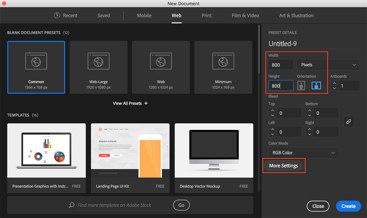
- Make a folder called “bb-communication-study”. Create a new Illustrator document at 800px X 800px.
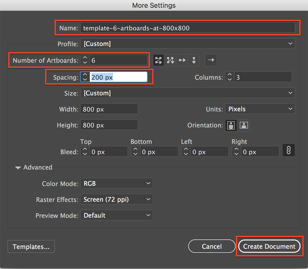
- Click the “More Options” button to increase the number of artboards to 6, and title the document “template-6-artboards-at-800×800”.
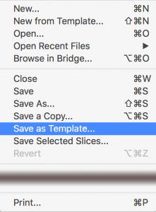
- Once it opens the new file, save it as a template. It will append “.ait” at the end of the filename.
- Next, do a “File >Save As” command and give it the name of the word you want to start with, such as “order-yourlastname.ai”.
Next: Arranging the Squares into Compositions
- On at least FOUR artboards, create different compositions using only black boxes that depict the given word.
- You can modify scale and the box arrangements, including overlapping shapes and extending beyond the picture plane.
- You can also add a white stroke if you wish, as well as adjusting the stroke size if so desired.
- You can do up to 6 compositions as long as you don’t take more than 10 minutes per word total.
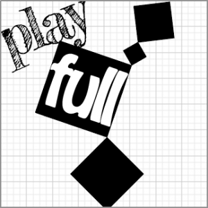
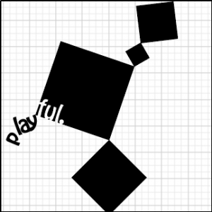
- For reference, here are some examples of the word “playful“

- HINT: It will serve you well to make a new layer for each composition so that your vector objects stay well-organized. This will be helpful later. To avoid accidentally adding objects to the wrong layers, lock the layers you want to avoid using.
- Save that file and close it.
- Repeat the process for each additional word by doing the following:
- choose “File > New from Template,”
- select the “template-6-artboards-at-800×800.ait” template you made,
- save it as the next word (ex: “playful-yourlastname.ai”),
- make your six new compositions,
- Close and repeat this process until you are finished.
- Don’t spend more than 10 minutes on each word (or 50min total).
Uploading for In-Class Critique
Once you have finished making arrangements for each word, open all of the saved files so that you can review the compositions and decide which one is your favorite for each word. For each file, do the following:
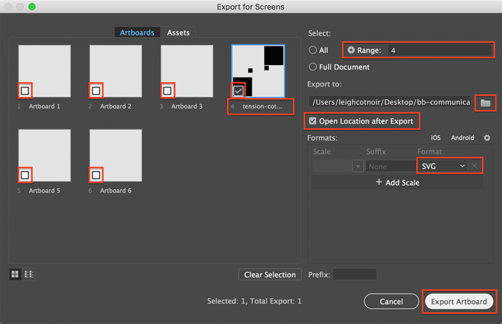
- go to “Export > Export for Screens”,
- isolate your favorite artboard for the word by deselecting the other artboards,
- double-click the artboard name and rename it (eg. “tension-yourlastname”)
- choose where you want to save the file under “Export to:” by clicking the folder icon,
- select the desired export file types (SVG = scalable vector graphic)
- Click “Export Artboard.
Once you have done this for each one, be sure that the resulting filenames use the correct naming convention (eg. “tension-yourlastname.svg) with the word BEFORE your last name. Then upload all of them to the folder specified by the instructor.
HOMEWORK ASSIGNMENT REFINEMENT
After you have completed the studies above, select the single composition you feel is the most successful of your 20 digital sketch iterations. That means you’ll only choose one composition from one word to work with.
1 : Setting up a new artboard in AI
Before embellishing the selected composition in your Illustrator file, you should duplicate the artboard. Open the word file for the comp you have selected, such as “playful-lastname.ai”, and create a new artboard that is 800px X 800px.
- Copy all of the contents of the chosen comp,
- Select the newly created artboard by clicking on it,
- Create a new layer in the Layers panel, and while the that layer is selected along with the new artboard, go to “Edit > Past In Place.” This will place a duplicate set of objects in your new artboard and within a new layer so that you can keep track of your original design iteration.
- Lock the other layers not in use and continue.
2: Add Typography
You will first add typography to the piece based on the communication you want to have, including the word you are portraying. Spend time truly exploring a range of type. Do not simply settle on a face after looking at type for only 10 minutes. Selecting appropriate fonts takes time. If you do not have a good selection of fonts on your computer, explore free, downloadable Google Fonts, as well as other free fonts from websites like DaFont.
If you want a primer on using the Google Fonts tools, you can watch the following video demonstration:
Add typography in the form of your word (or a slightly modified version of it if it suits you), playing with font style (regular, bold, condensed, etc.), scale, placement, letter-spacing, and even the letterforms if it makes sense. To modify actual letterforms (shapes of the letters), you will need to convert the type into vector shapes by selecting the text and going to “Type > Create Outlines.” After doing this you can individually modify the anchor points with the white arrow tool (“Direct Selection Tool).
When you find a solution that might work, duplicate your work into a new artboard and layer iteration to continue experimenting. Keep track of every iteration through the artboard process so that you have a record of your design evolution and explorations.
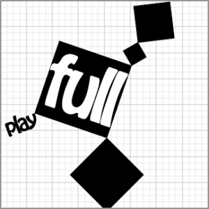
The examples below use both the actual word, “playful”, as well as word play on two words, “play” and “full”:
3: Add imagery
Once you have started exploring the addition of typography with at least a couple of iterations, create a new artboard that allows you to add imagery. To add images properly in an Illustrator file, use the “File > Place” menu command. You should download, move, or make a copy of the original image file(s) inside the same folder in which the Illustrator file resides. This is because files are LINKED to one another in Illustrator, not embedded. If you don’t do this, you will very likely lose the image when transporting your files from one computer to another (including turning work in for evaluation).
When selecting imagery, steer clear of trite or predictable memes. Try to think outside the box (no pun intended).
To fully explore the best range of possibilities, you must make a minimum of 8 iterations of the selected study composition with typography and imagery. Evidence of all iterations must be present in your AI file for full credit.
Example iterations (hover for descriptions of changes):
4 : Completing and turning in the assignment
- When complete, you need to go to “File > Package” to create a folder that has all assets and fonts necessary for the instructor to grade your work and for you to be certain you aren’t missing any asset files or specialty fonts.
- Next, use “File > Export > Export for Screens” to archive your artboards as jpg or png files so that you have rasterized versions of the images. Save them into your packages folder.
- Finally, upload your work to the server in the location designated in class by the instructor when finished.

