Project1 : Painterly Compositing
20% of Full Semester Grade
Quick Links on this Page:
Overview
In this assignment, students will create a “painterly” composited artwork that combines multiple images and tool techniques so that the final work is reflective of illustrative, painterly, and representational art. The final work should not reflect photorealism.
Not sure what “painterly” means? Here’s a simple definition:
The term “painterly” is used to describe a painting done in a style that embraces, shows, and celebrates the medium in which it is created (be it oil paint, acrylics, pastels, watercolor, etc.), rather than trying to hide the act of creation. (resource: About – Art Glossary Definition)
Not sure what “representational art” is? Here is a basic explanation:
In painting and sculpture, the term “representational art” usually refers to images that are clearly recognizable for what they purport to be, such as a human figure, a banana, a tree, and so on. Such images need not be true to life. So a tree does not have to be green, or even upright, but it must clearly represent or be recognizable as a tree. By contrast, non-representational or abstract art consists of images that have no clear identity, and must be interpreted by the viewer. (read more at the source: Representational Art)
Tools and Techniques Addressed
- Camera Raw color processing
- Smart objects
- Layers
- Color correction
- Advanced selections
- Masks
- Adjustment layers
- Reparation
- Painting methods
- Advanced brushes and fills
Principles and Elements of Art
- Composition
- Elements of Art: Line | Space | Shape | Value | Color
- Principles of Art: Harmony | Balance | Proportion | Dominance/Emphasis | Variety | Movement | Rhythm
- Painterly art style
- Representational art
Concept and Content Requirements
Concept:
Create a composite image from multiple source image files so that the final result meets all of the following criteria:
- Final work expresses and reflects the concept of “inspiration.”
- Final work falls within the range of “representational art” yet is still “painterly.”
(The image or its component parts should not look photorealistic in the final version, as if parts of it were taken with a camera. It should look “hand-rendered” to a large degree.) - Final work is original in ideation.
- Original source images are significantly changed enough to create a unique and new final artwork.
Content:
- Use a minimum of two separate source images as the basis of your composition. Be sure that you change the originals enough through Photoshop techniques (see Technical Requirements below) to create an original artwork.
- *Be sure to “place” your resource files as “Smart Objects” into the target composition file so that you can dynamically adjust scale without changing the files’ native resolutions.*
Technical Requirements
Technical Setup:
- Color Mode: RGB
- Image resolution: 72 ppi
- Minimum pixel ratios/sizes for final output (select one):
- 1:1 (square): 1080 x 1080 (Instagram “post”)
- 4:5 (vertical): 1080 x 1350 (Instagram “portrait”)
- 9:16 (vertical): 1080 x 1920 (Instagram “story”)
- 16:9 (horizontal): 1920 x 1080 (multiple media)
- Resulting final image files to turn in:
- PSD file (lastname_p3_still.psd)
- JPG (lastname_p3_still.jpg)
- NOTE: I will not issue a grade if you do not turn in your original PSD file that shows layers, adjustments, filters, etc.
Color Corrections: Use Bridge/Camera Raw on original source images to non-destructively correct color and tonal ranges.
Layer Styles, Blending Modes, and Filters: Did you adequately use these tools and techniques to contribute to your composite’s success?
Smart Objects: “Place” your resource files as “Smart Objects” into the target composition file so that you can dynamically adjust scale without changing the files’ native resolutions. If you must rasterize layers for destructive editing, be sure to keep original Smart layer(s) so that I can see where you started.
Layers and Layer Groups: Clearly organize, group, and label layers in the file.
Selections: Use combinations of appropriate selection tools to create and save complex selections for reuse and masking.
Masks and channels: Use masks and channels to non-destructively “eliminate” portions of the original resource files. Avoid using the eraser tool or deleting original content.
Adjustment Layers: Use at least 2 non-destructive layer adjustments to adjust color or tonal range.
Reparation: Use reparation tools (healing brushes, clone stamp, content-aware tool, etc.) as necessary to correct blemishes or undesirable visual content in areas you need to keep in the composition.
!!! >>> Painting Methods: Explore a variety of brushes and paint brush styles to create a “painterly” effect on the work. This includes blending methods of using Dry brushes to Very Wet brushes, adjusting flow and opacities for brushes, cleaning and loading paint brushes, and exploring different brush tips and dynamics. Advanced brushes and fills: Explore using different brush types, sizes, and dynamics in composition. You can also use the smudge tool to push and pull pixels so that they have a blended effect as with paint or charcoal.
GRADING RUBRIC. The first assignment is graded on earnest participation initial ideation process and is 10% (or 10 points) of the entire project. The second assignment in the project is 90% (or 90 points) of the project. To see its grading criteria, download the “Project 1 – Assignment 2 – Painterly Composite Grading Rubric” to help you understand what is important to focus on. This rubric breaks down scoring and also covers not only Technical Competencies categories listed above (35points), but also Design and Composition categories (45 points), as well as Delivery/Presentation/Communication line items (10 points).
Due at the Critique
- Upload the following to the server in your student directory (see Canvas for server connecting info):
- project1-lastname.zip (zipped folder)
- lastname_p1_still.psd
- lastname_p1_still.jpg
- any-other-necessary-linked-files.jpg
- project1-lastname.zip (zipped folder)
- Participate in the “Project-1 Composite Creation + Final Presentation” discussion in our MAT 210 Canvas class.
Process
Part 1A:
Where to start? Some suggestions….
First, here are some project content requirements to consider:
- Final work expresses and reflects the concept of “inspiration.”
- Final work falls within the range of “representational art” yet is still “painterly.”
(The image or its component parts should not look photorealistic in the final version, as if parts of it were taken with a camera. It should look “hand-rendered” to a large degree.) - Final work is original in ideation.
- Original source images are significantly changed enough to create a unique and new final artwork.
- You need to use a minimum of 2 images to create the composite.
Based on those content parameters, think about what you want to depict. If it doesn’t jump right out to you, look through a lot of image resources to get ideas. Some options for free, quality, high resolution images can be located on the following page:
It is VERY IMPORTANT that when compositing multiple images that you significantly change important parts of the original images’ compositions to make the final product your own. Do not rely too much on a single background image to communicate your message because it is unlikely that you will transform it enough to claim originality. Also very important: remember to consider the independent resolutions of different images you find and how they will work together. Images with low resolution for your desired scale might not work well in the final output, depending on how much it is modified.
Consider the following:
- how color can illustrate characteristics of objects, spaces, or figures (hot, cold, warm, cool, anxious, calm, stable, etc.). Also consider how changing expected colors of familiar things can unsettle viewers.
- how color schemes can also communicate mood (analogous can be subtle, complimentary can “pop” for conflict or excitement, etc.)
- how varying the scale of elements in the composition can affect the audience’s perception of space, hierarchy, and reality
- about line placement and line quality, especially when painting with brushes. People have fairly predictable reactions to certain line styles. You can communicate feelings via line manipulation in images. Some standard associations are as follows:
- diagonal : dynamic, movement
- spiral : depression, confusion, anxiety, off-balance
- crossed lines : fear, anger, frustration, impact
- vertical : hope, uplifting, peaceful motion
- horizontal : calmness, stability
- zig-zag, squiggles : erratic, energy, commotion
- making the composition more dynamic by moving design components partially off the picture plane/frame to keep the viewers’ eyes moving in and out of the composition.
- compositing images to give a sense of dramatic spacial perspective. Common ways to communicate space in 2-D art is through employing overlapping shapes, using positive/negative shapes, and value difference, and varying objects’ scales.
Questions about any of the terminology above? Find it on the art vocabulary list.
Another technical requirement you might want to consider at the beginning as you gather resources is the scale of images you need. Below are the final output dimensions that you can choose from:
- Minimum pixel ratios/sizes for final output (select one):
- 1:1 (square): 1080 x 1080 (Instagram “post”)
- 4:5 (vertical): 1080 x 1350 (Instagram “portrait”)
- 9:16 (vertical): 1080 x 1920 (Instagram “story”)
- 16:9 (horizontal): 1920 x 1080 (multiple media)
Part 1B:
Idea Generation and Sketches
Based on your collection of imagery, sketch out at least three different compositions with pencil and paper. These can be very rough sketches and are intended to provide noncommittal ideas of how to reorganize visual information from your multiple images into one cohesive piece. Do not forget that you should change aspects of the images as you draw (such as scale, perspective, color, value, elimination/masking of image sections).
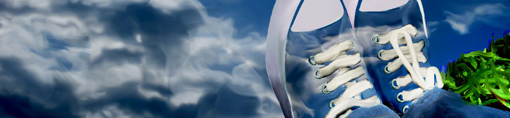
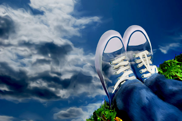
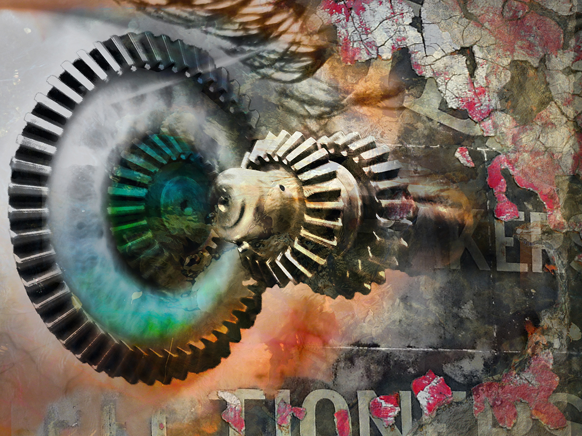
Student Case Study #1:
Inspiration: “contemplative”
Final composite:
")
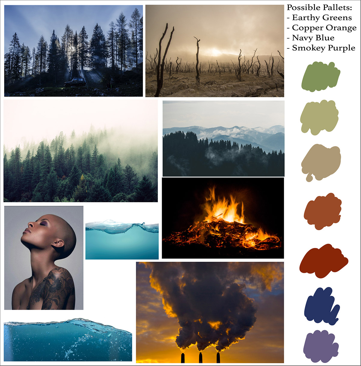
Image research, color palette exploration:
Animated Process Documentation:
Case Study #2
Animated PSD Documentation Example 2
This student was focused on creating commercial looking work for his portfolio, so he we given a special exception for the use of text in this case. ANY use of text required special permission with a specific proposal.
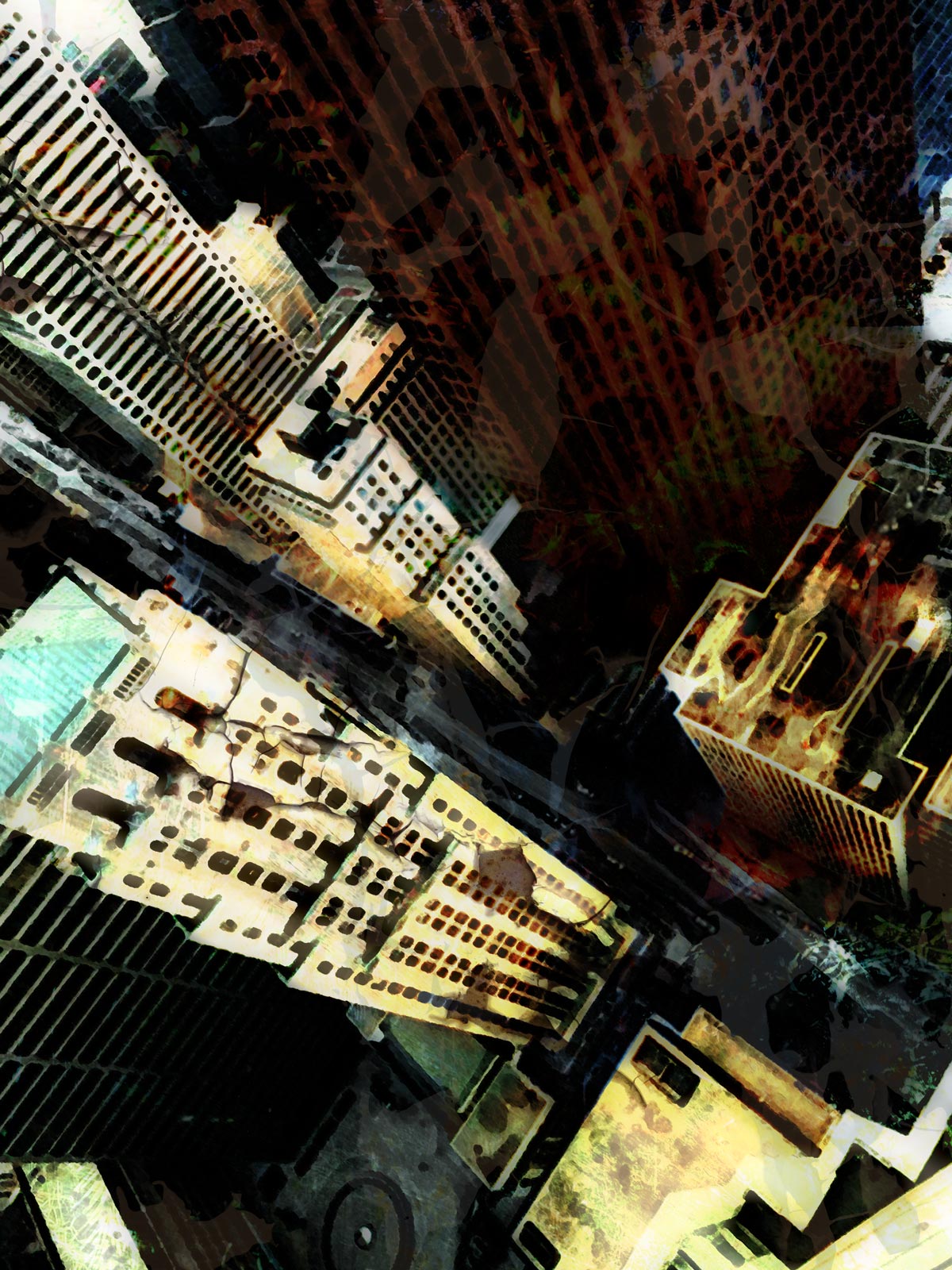
Case Study #3
This is an example of a completed work to give you an idea of concept execution and stylistic options. This was based on the word “whimsical” and is a depiction of a daydream.
Final Composite (flat file)
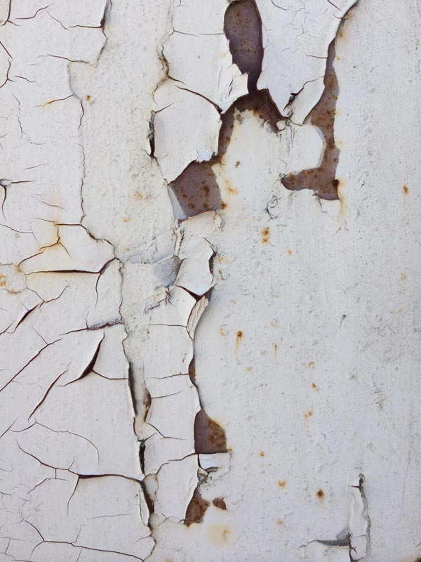
Original resource images used:

Instructor Process Video example:
This project outline gives you several instructor-provided examples to illustrate different process and technique approaches to beginning, constructing, and completing the a painterly Photoshop composite. Immediately below is a three-part example that covers 1) ideation, 2) construction, and 3) exploring HDR toning and painting tools. It is a total of ~45 minutes, although you can speed up the playback to shorten the time, slowing it down where necessary for clarity.
For the ideation portion, the first video is extremely relevant in understanding the thought process that goes into image resource selection. Videos #2 and #3 of the playlist will better help you understand a fuller artistic compositing process for the next assignment phase of the project.
Phase 2:
Start Compositing in Photoshop
Based on your drawing explorations, choose a direction and start compositing in Photoshop using Photoshop tools and techniques required in this assignment (see below). Be very deliberate throughout this process to clearly organize and label your layers.
To get an idea of some techniques that you can employ that are different from the previous example’s approach, you can watch the following 15-minute succinct demo that walks you through a basic review of putting together an artistic PSD composition. This is an abridged version of the process but will give you an overview of some ideas and processes you will use in the assignment. While artistic paint brush techniques were used to create layers in the following video, it does not walk you through using specific brushes. You need to explore and practice those techniques through other lessons to see which ones are right for your compositional needs.
Building the PSD Painterly Composition (15min)


")


")

")


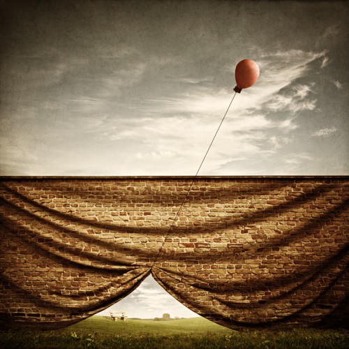
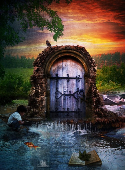
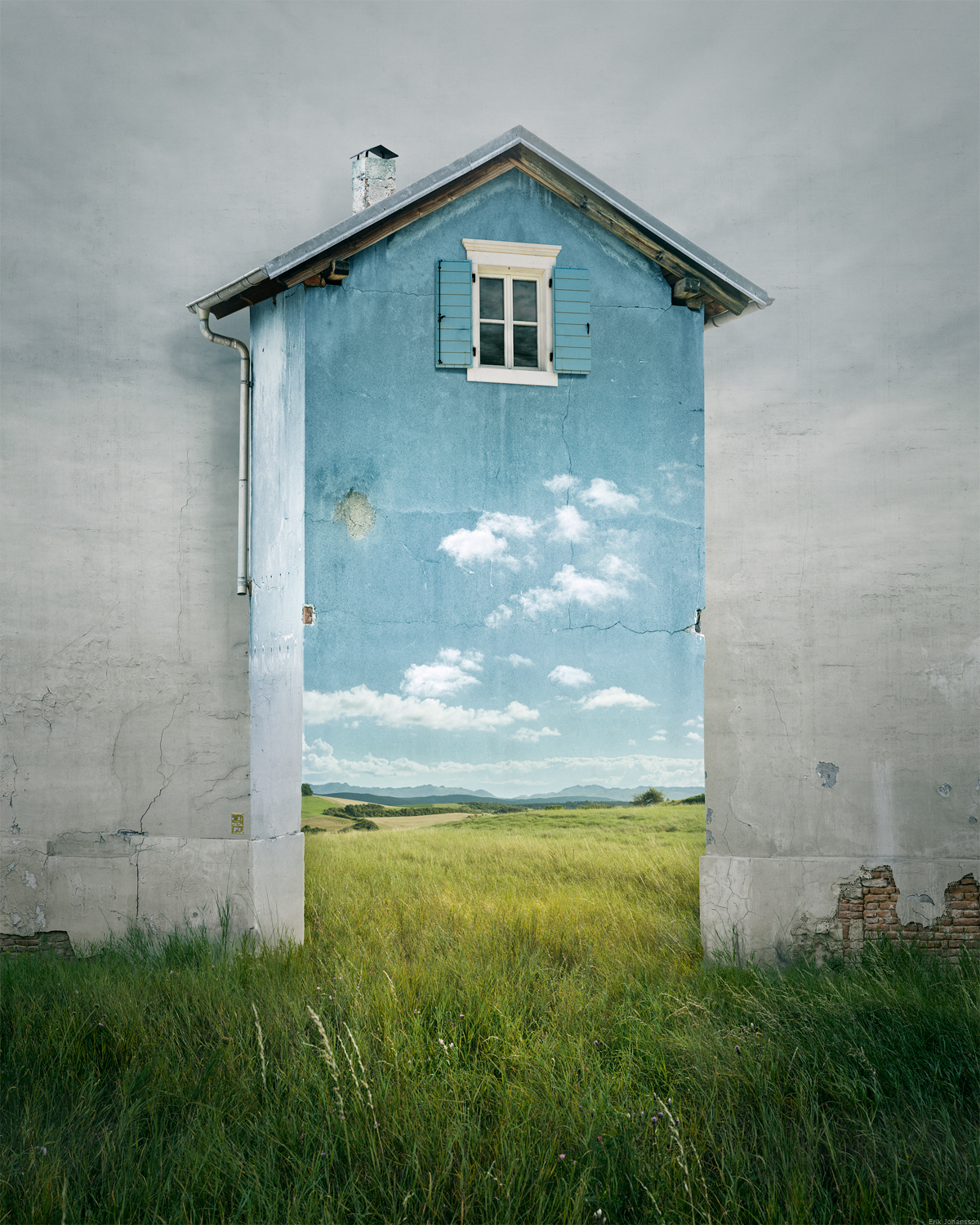
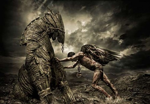
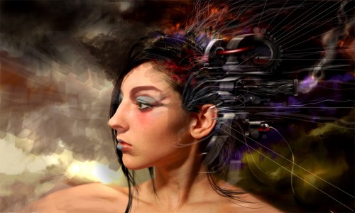
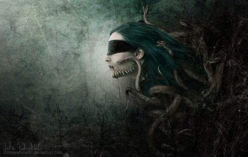
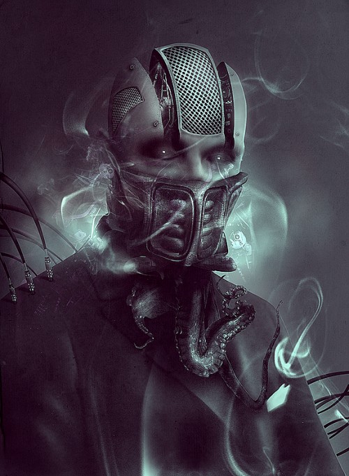
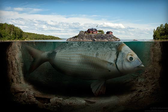
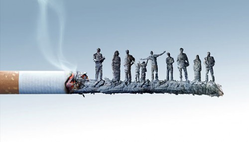
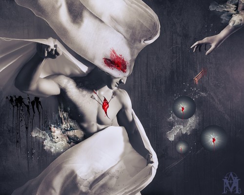
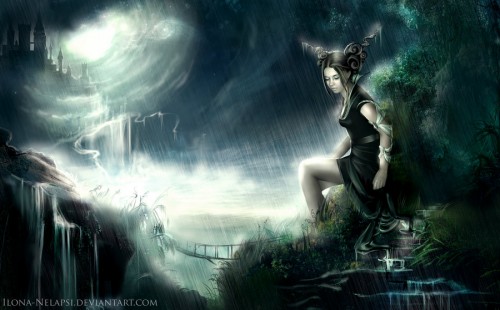
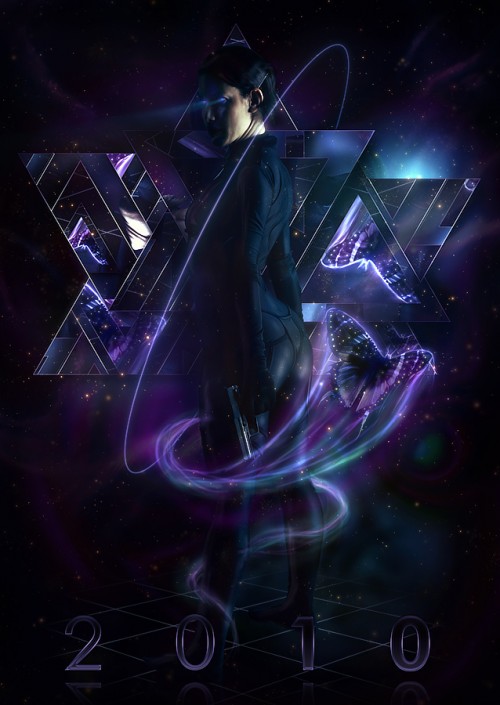
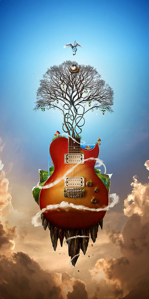
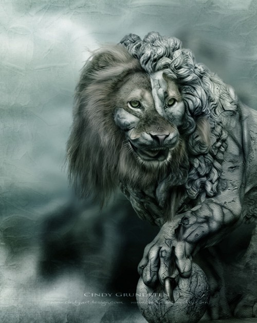
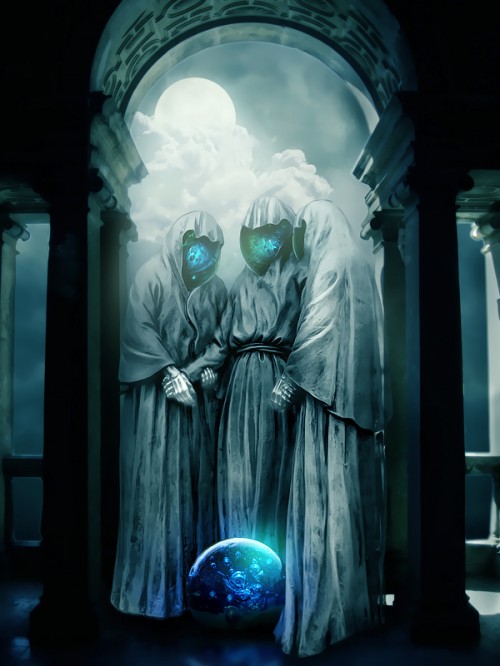
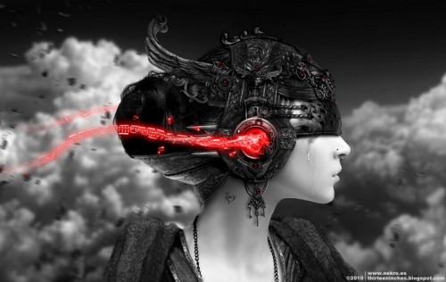
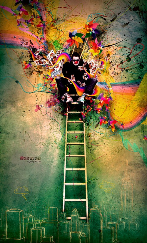
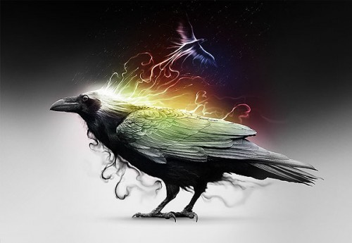
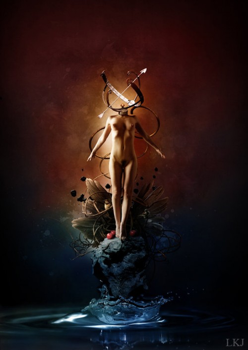
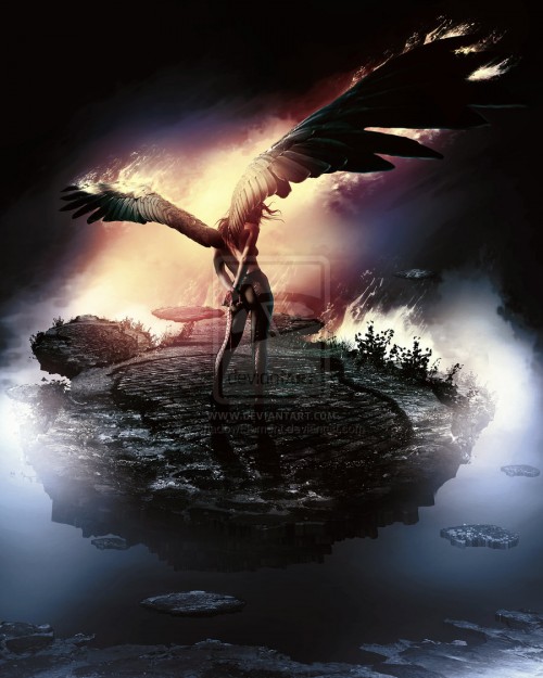
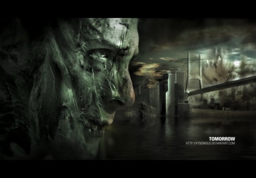
Additional Painterly Composite Inspiration:
Many of the images below are clickable so that you can go to the artist’s page to view more of their similar work if you are drawn to someone’s style.