
Project-3 : Movie Genre Film Still (Advanced Creative Compositing)
25% of Semester Grade
Quick Links on this Page:
- Overview
- Concepts, Tools, and Techniques Covered
- Project Process Assignments
- Assignment 1: Initial Ideation Process (do Parts A+B)
- Assignment 2: Peer Progress Draft Critique
- Assignment 3: Final Presentation and Critique
- Concept and Content Requirements
- Technical Requirements
Overview
Create a simple, original movie backstory based on one of the genres below and depict it in a composited image that looks like a film/video still frame.
Acceptable Genres (do not deviate from this list.)
- Action
- Adventure
- Science-fiction
- Fantasy
- Crime
- Thriller
- Western
- Horror
- (Genres outside of this list should not be considered as primary categories.)
You will interpret your invented film’s back-story by making a movie still-frame landscape composite from a minimum of 5 (maximum of 8) separate images. Do NOT use the story of an existing film. Your idea must be your own. You will write a short paragraph blurb about the movie to help direct your image selection.
The final image should look realistic, although 3D-styled, filtered computer graphic effects and fantasy scenes are acceptable. Images should be modified enough that they contribute to a new, unique creation. No single image should create too much of the final composition. Specific limitations: 1) Cartoon animation styling and illustration are not an acceptable format for this assignment. 2) Galaxy stardust / interstellar images are no longer allowed in this assignment without explicit permission.
This image is not to be confused with a movie poster or posed image (i.e. publicity film stills). It is intended to be a still frame grabbed from a place in the movie which embodies the mood of the film. You are also encouraged to use photography that you take yourself so that your work is as original as possible and so that you have imagery based on your ideas (instead of basing your ideas on found imagery).
Concepts, Tools, Techniques Covered
Tools and Techniques
- Camera Raw color processing
- Smart objects
- Smart Filters
- Layers
- Color correction
- Advanced selections
- Masks
- Adjustment layers
- Reparation
- Painting methods
- Advanced brushes and fills
Concepts
- Composition
- Elements of Art: Line | Space | Shape | Value | Color
- Principles of Art: Harmony | Balance | Proportion | Dominance/Emphasis | Variety | Movement | Rhythm
Project Process Assignments
There are three assignments that comprise the full process arc of Project-3. The individual point values of these assignments combine to total 100 points, comprising your full Project weighted grade. The weighted Project grade represents 25% of your full semester grade. The three Project-3 sub-assignments are as follows:
- Assignment 1: Initial Ideation Process (25 points)
- Part A: Ideation + Resource Gathering
- Part B: Sketching Composite Scenes
- Assignment 2: Peer Progress Draft Critique (30 points)
- Assignment 3: Final Presentation and Critique (45 points)
For details of each process phase / assignment requirements, see the collapsible sections below. Please note that Assignment 1 is comprised of both Parts A + B. In other words, A and B are not separate assignments. They are evaluated together.
Assignment 1 (Part A): Ideation + Resource Gathering
(25 points)
Where to start? Some suggestions….
First, think about the kind of story you would want to depict in a movie’s single, still-frame grab. Think about how a single image can convey a multitude of ideas and give cues about not only what is happening in the scene, but also about:
- the state of mind of the viewer
- the state of mind of the people in the scene if you use images of people
- and an overarching sense of what the movie’s theme embodies.
What NOT to do in your process:
1) Don’t create the equivalent of a posed movie poster. While movie posters are intended to visually relate a movie’s theme, they are not necessarily good at capturing a specific moment in time and the psychology of a specific landscape. Your image should instead be a well-curated snapshot in time.
2) Don’t create a scene littered with people/figures. While this might fall under the realm of capturing a specific point in time, creating a composition with a lot of people/figures will likely limit your options for creating an effective and well-balanced composition. Consider some problems: many separate images with figures are likely to have different light sources, which can be hard to overcome in a composite. A single image with a lot of people might overwhelm the composition if not used properly. If you choose to use an image with a lot of people in it, the results should be remarkable to justify it in this context.
3) Don’t choose a large single background image in which you plan to simply drop in smaller elements. This falls under the category of relying too much on one image to build your composition. Your grade will likely be reduced if you use this approach . Make the composition your own and not a shadow of someone else’s work or a mere modification of photography. (Additionally, interstellar/galaxy stardust images are no longer permitted without specific instructor approval. These images are too often used as crutches to deal with space in an otherwise creative way.)
4) DO NOT INCLUDE TEXT. The use of text in this assignment is forbidden unless it happens to be on a sign that is part of an existing photograph. You are not to add any overlay text at all. The image should communicate on its own without the assistance of textual translation.
What TO DO in your process:
Now that we got what not to do out of the way, let’s focus on so requirements you need to include.
- Use a minimum of five separate source images as the basis of your composition (up to a maximum of eight images). Be sure that you change the originals enough through Photoshop techniques (see Technical Requirements below) to create an original artwork.
- When selecting or shooting images, avoid creating a distant landscape composite, where everything is in a deep middle ground and background. Images with all three distinct spaces–foreground, middle ground, and background–create a sense of dramatic depth of field that places the viewer “in” the scene or the action. If everything is viewed at a a similar distance, it is generally flat and BORING.
- To create a dramatic sense of depth, you can utilize foundational art principles, such as altering the scale of different objects (nearer objects appear larger), overlapping shapes, altering contrast of objects in different grounds (i.e. lower contrast for very distant objects vs higher contrast and clarity of closer objects), etc.
- Pay CLOSE attention to accurate perspective and light sources / shadows so that they match. If either of these are even remotely off, the composite will immediately seem fake.
- Be sure to use “Place Linked” for resource files into the target composition file so that you can dynamically adjust scale without changing the files’ native resolutions. You can also then use Smart filters on them.
- Review the Technical Requirements at the bottom of this page to ensure that you understand the expectation for using Photoshop’s tools.
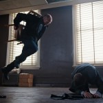
Some Movie Still Examples
The following examples below are only intended to give you some ideas of still frames that truly capture a moment in a film, whether through action, color, movement, and object scale or through isolation, color, and overwhelming the human scale.
Consider this: All of the following examples can be considered landscapes of sorts. Landscapes are not only defined by dramatic distance and depth of field (as in a countryside or cityscape), but they can also be defined psychologically and by their settings (urban, suburban, surreal, space, pastoral, interior, exterior, domestic, foreign, war, etc.). Think about the types of landscapes that the images below evoke.
Click on the images below to see full details:


It is important to come up with your idea and backstory FIRST. This will not only help your process of finding images to work with easier, but it will also make your visual communication more honest and effective.
Although this is an online course, the final output is specified for print to address learning outcomes surrounding print issues. The beginning and ending resolution of your composite should be 2560px X 1440px at 72ppi. This size will allow you to constrain the resolution to print dimensions for a print capable of 8.5″ x 4.8″ at 300ppi.
To be certain that you meet the resolution requirements, first create an empty Photoshop file at 2560px X 1440px at 72ppi, and then add linked support files in it as Smart Objects. This will prevent resolution mismatch problems.
It is critical that you use only high quality, high resolution resource files. Some options for free, quality, high resolution images are:
- https://unsplash.com/
- http://morguefile.com/
- http://digitalcollections.nypl.org/
- http://archive.org/
- More: https://learn.leighcotnoir.com/2017/12/free-media-resources/#resources
Reiteration: It is VERY IMPORTANT that when compositing multiple images that you significantly change important parts of the original images’ compositions to make the final product your own. Do not rely too much on a single background image to communicate your message because it is unlikely that you will transform it enough to claim originality. Also very important: remember to consider the independent resolutions of different images you find and how they will work together. Images with low resolution for your desired scale might not work well in the final output, depending on how much it is modified.
Consider the following:
- how color can illustrate characteristics of objects, spaces, or figures (hot, cold, warm, cool, anxious, calm, stable, etc.). Also consider how changing expected colors of familiar things can unsettle viewers.
- how color schemes can also communicate mood (analogous can be subtle, complimentary can “pop” for conflict or excitement, etc.)
- how varying the scale of elements in the composition can affect the audience’s perception of space, hierarchy, and reality
- about line placement and line quality, especially when painting with brushes. People have fairly predictable reactions to certain line styles. You can communicate feelings via line manipulation in images. Some standard associations are as follows:
- diagonal : dynamic, movement
- spiral : depression, confusion, anxiety, off-balance
- crossed lines : fear, anger, frustration, impact
- vertical : hope, uplifting, peaceful motion
- horizontal : calmness, stability
- zig-zag, squiggles : erratic, energy, commotion
- making the composition more dynamic by moving design components partially off the picture plane/frame to keep the viewers’ eyes moving in and out of the composition.
- compositing images to give a sense of dramatic spacial perspective. Common ways to communicate space in 2-D art is through employing overlapping shapes, using positive/negative shapes, and value difference, and varying objects’ scales.
Questions about any of the terminology above? Find it on the art vocabulary list.
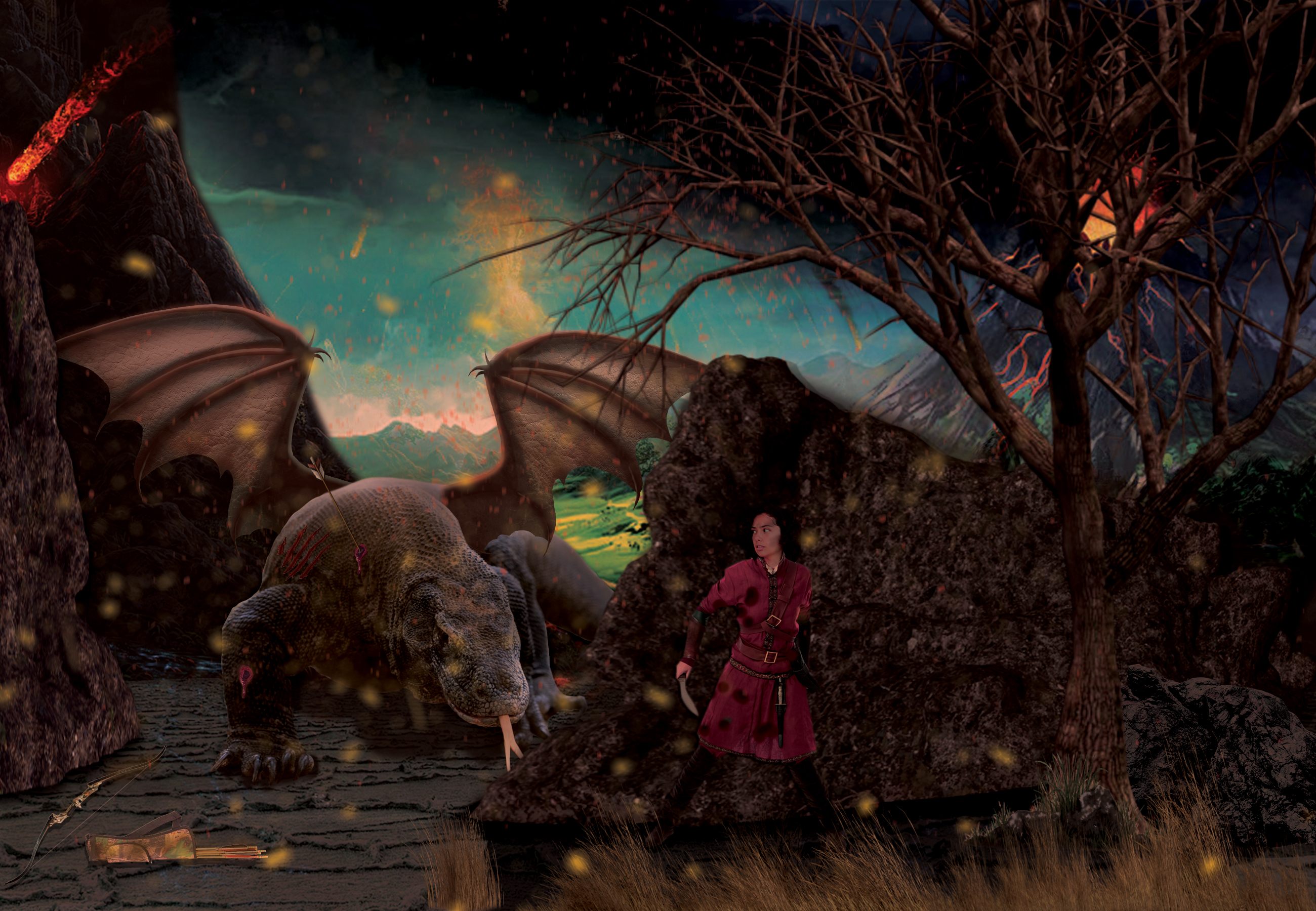
Example Student Work Process
To see an example of how a former student used many components from multiple resources to make a unified, immersive, and believable scene from an imaginary Fantasy Action / Adventure plot, check out the following resources he used, and then compare the components to the final composite. Notice how well he blended in the pieces so that the light sources all seemed real, how the color is in sync, and how clean the selections are. Also notice the inventiveness in his creation of the dragon (from a lizard) and the action of the figures in the composition.


OTHER PROCESS EXAMPLES:


Assignment 1 (PartB): Sketching Composite Scenes
Creating Meaningful Sketches
Based on your collection of imagery, sketch out at least three different potential compositions with pencil and paper. These can be very rough sketches and are intended to provide noncommittal ideas of how to reorganize visual information from your multiple images into one cohesive piece. Do not forget that you should change aspects of the images as you draw (such as scale, perspective, color, value, elimination/masking of image sections). Remember, these do not have to be sophisticated masterpieces, but spend time on them and do your very best to illustrate what you hope to display and communicate. For instance, do not make the equivalent of “stick figure” drawings…make a real effort even if you don’t feel confident in your sketching abilities.
TURNING WORK IN FOR ASSIGNMENT 1
To complete Assignment 1: Initial Ideation Process, do and turn in the following to the related Canvas discussion board:
- List genre: Which movie genre did you select?
- Write blurb(s): Write a short paragraph on what the fictitious movie is about to help us understand the essence of the story. If you are uncertain, you can write more than one version.
- Resources images: Post images (minimum of 5) that you think you would like to use. Because you should be choosing high-resolution images, you will probably need to save smaller copies to upload to the discussion.
- Sketches: Post photos of your hand-drawn sketches. Color correct them for good contrast if the lighting isn’t great. You are required to draw a minimum of 3 sketches of potential ideas.
Assignment 2: Composite a Draft in Photoshop
(30 points)
Start Compositing in Photoshop
Based on your drawing explorations, choose a direction and start compositing in Photoshop using Photoshop tools and techniques required in this assignment (see below).
- Techniques you should be employing are as follows:
- Camera Raw adjustments
- use of selections and masking
- adjustment layers
- layer blending modes
- subtle use of filters where necessary
- HDR filters if desired
- layer organization (groups, color-coding)
- Smart Objects and Smart filters
More Example Student Work
To get further inspiration from more student examples, check out click on the images below to see the larger images.


TURNING WORK IN FOR ASSIGNMENT 2
To complete Assignment 2: Composite a Draft in Photoshop, do and turn in the following to the related Canvas discussion board:
1) Post flattened jpg or png draft(s) to discussion.
2) Discuss your goals.
3) Discuss your challenges.
4) Discuss your solutions (both resolved and potential ones).
5) List any specific questions for which you hope to get feedback.
6) Respond to classmates by providing HELPFUL feedback to at least three people.
(You can write this in paragraph form OR in prompt>response format. You choose. Just make sure you address all requirements above.)
Assignment 3: Final Presentation and Critique
(45 points)
Improvements and quality craftsmanship are required.
In this last project phase / assignment, you are required to complete your composite while also making improvements from your draft state. Take a look at the grading rubric to understand how your work will be evaluated.
Final Output
The highest level of target output for this assignment will be print. Although this is an online course, you still need to prepare your files for print. The dimensions need to be in a 16:9 ratio at a minimum of 2560px X 1440px at 72ppi. This size will allow ppi resolution constraint to print an 8.5″ x 4.8″ print at 300ppi. BE SURE that the quality looks good at 100% on the screen.
TURNING IN ASSIGNMENT 3
To complete Assignment 3: Final Presentation + Critique, do and turn in the following to the related Canvas discussion board:
1) Post a copy of your completed, flattened final Project-3 work to discussion.
2) Discuss your original and modified goals over the course of the project. Explain how your landscape evolved through your story and manipulation of imagery.
3) Discuss your challenges you faced and solutions to those problems.
4) Discuss specific ways you improved the work from the draft you previously submitted.
5) Explain any artistic growth (conceptual or skill-based) you feel you achieved in the course of this project.
—
6) Provide MEANINGFUL feedback to at least three people.
(You can write this in paragraph form or in prompt>response format. You choose. Just make sure you address all requirements above.
—
7) Upload the following to the MAT server (REQUIRED FOR A GRADE!):
- lastname_p3_still.psd
- lastname_p3_still.jpg
- all supporting linked Smart files with functional links. (TEST your package before uploading the folder!)
Technical Requirements
Technical Setup: …Mode: CMYK, …Minimum size: 2560px X 1440px at 72ppi, …Resulting image files: • 1 PSD (lastname_p3_still.psd + ALL linked Smart Object files in appropriate location) • 1 high-resolution JPG (lastname_p3_still.jpg)
Color Corrections: Use Bridge/Camera Raw on original source images to non-destructively correct color and tonal ranges.
Smart Objects: “Place” your resource files as “Smart Objects” into the target composition file so that you can dynamically adjust scale without changing the files’ native resolutions. BE SURE to keep Smart Object resource files in same folder as your main PSD composite file. This will make uploading final work easier to avoid broken links.
Layers and Layer Groups: Clearly organize, group, and label your layers for the file.
Selections: Use combinations of appropriate selection tools to create and save complex selections for reuse and masking.
Masks and channels: Use masks and channels to non-destructively “eliminate” portions of the original resource files. Try to avoid using the eraser tool or deleting original content.
Use of layer styles, blend modes, and filters: Use layer styles, blend modes, and filters to enhance your composition’s color, texture, highlights, shadows, and overall drama.
Adjustment Layers: Use at least 2 non-destructive layer adjustments to adjust color or tonal range.
Reparation: Use reparation tools (healing brushes, clone stamp, content-aware tool, etc.) as necessary to correct blemishes or undesirable visual content in areas you need to keep in the composition.
Brushes: Create a custom brush. Also, explore a variety of brushes and brush techniques, adjusting flow and opacities for brushes, and experimenting with different brush tips and dynamics. Use brushes with multiple tools (smudge, saturation, paint, etc.).