
Creating a Mobile-First Design Template for Your PHP Project
This demo will give you guidance in styling a web page with HTML5 markup from a mobile-first design approach. It covers the following concepts, principles, and methods:
- the php/html starter file’s proper markup
- how to add Google Fonts to a design
- using a viewport/device-width meta tag
- removing native browser styling with a ‘reset’ css file
- using @viewport and @-ms-viewport in CSS
- designing for smallest screens in mind first
- using @media queries to alter layout on larger screens
- styling a baseline for very commonly used elements
To follow along with these videos using the exact same markup, download the template ‘project1’ folder in a zipped file. After downloading, unzip and place the unzipped folder into your “htdocs/” folder to work on the files.
Creating a Mobile-First Responsive Site Template
(7-Part Video Demo Playlist BELOW)
Approximately 2.5 hours of demo. Expect the work you do to create your own base design template to take a minimum of 8 hours.
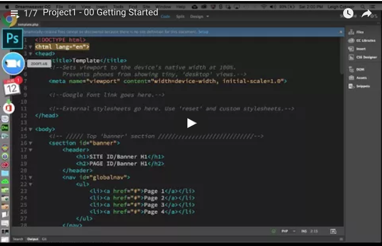
00 – Getting Started (19:37)
01 – Start Styling (27:49)
02 – Styling the Banner (24:46)
03 – Styling the Banner’s NAV (22:25)
04 – Styling the Baseline Content (20:53)
05 – Styling the Baseline Content (Continued 14:26)
06 – Styling the Footer / Using Additional Breakpoints (22:51)
Want to learn more about using Google Web Fonts?
Check this video out.
Useful Project Resources
- Mobile-First Responsive Web Design (good article by Brad Frost)
- CSS Reset: http://www.cssreset.com/
- Font Shorthand Order
- CSS3 Transitions
- CSS3 Generator (tool that helps you generate box shadows, text shadows, gradients, button styles, etc.